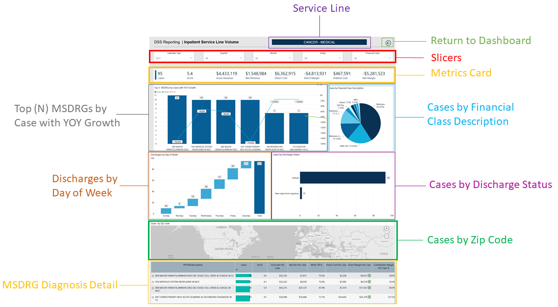
Inpatient Service Line Volume page
Overview
This page provides the volume details for a specific service line selected in the Inpatient Service Line Dashboard.
The top of the page displays the service line the page applies to. To return to the Inpatient Service Line Dashboard, click the arrow in the upper right corner.
Click image to view full size
The following sections describe the different areas of this page.
Slicers
This section allows you to filter data by time (calendar year, quarter, month), entity, and financial class. From the drop-downs, you can select a combination of the available options to configure the data parameters for this page.

Click image to view full size
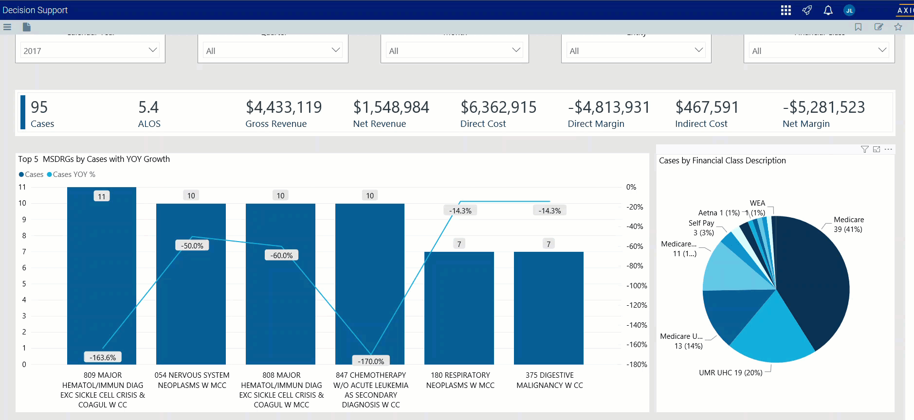
Metrics Card
This section displays KPI data for visits, gross and net revenue, direct and indirect cost, and direct and net margin. As you select the different options from the different areas on the page, the totals in the Metrics Card adjust accordingly.

Click image to view full size
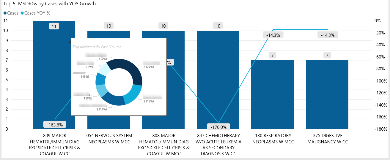
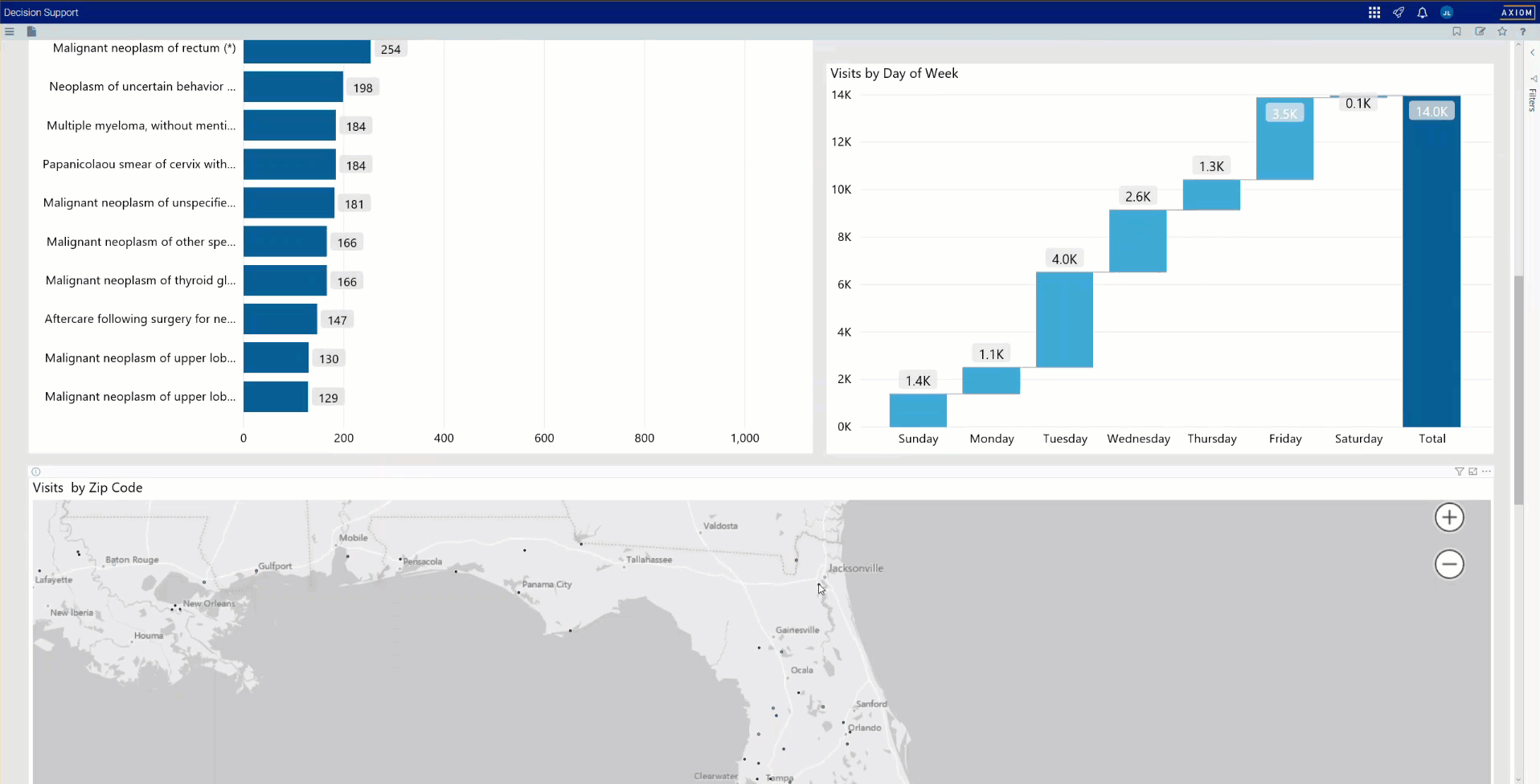
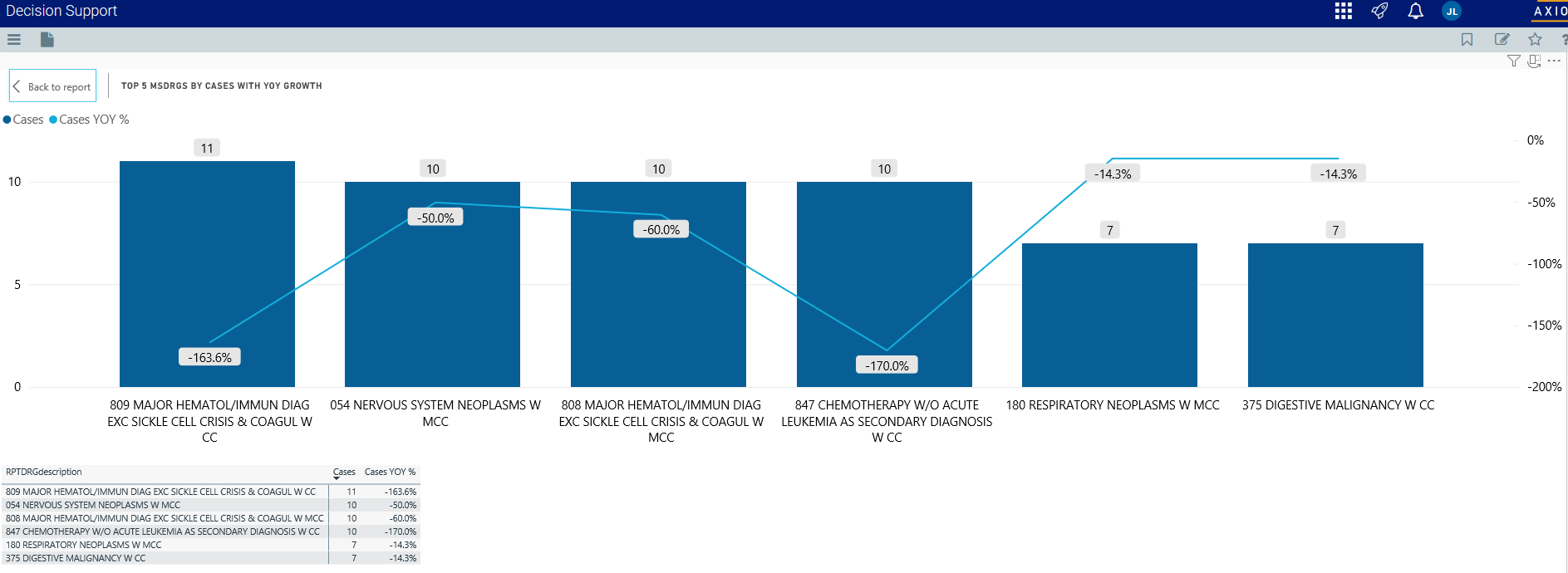
Top (N) MSDRGs by Cases with YOY Growth
This section displays a bar graph of the top cases with a graph line that shows the YOY growth percentage. From here, you can do the following:
-
View a breakdown of the top admitters by case volume by hovering your cursor over any bar.

Click image to view full size
-
View the KPIs specific to a case type by clicking a bar. The sections of the page will adjust to show data specific to that diagnosis.

Click image to view animated GIF full size
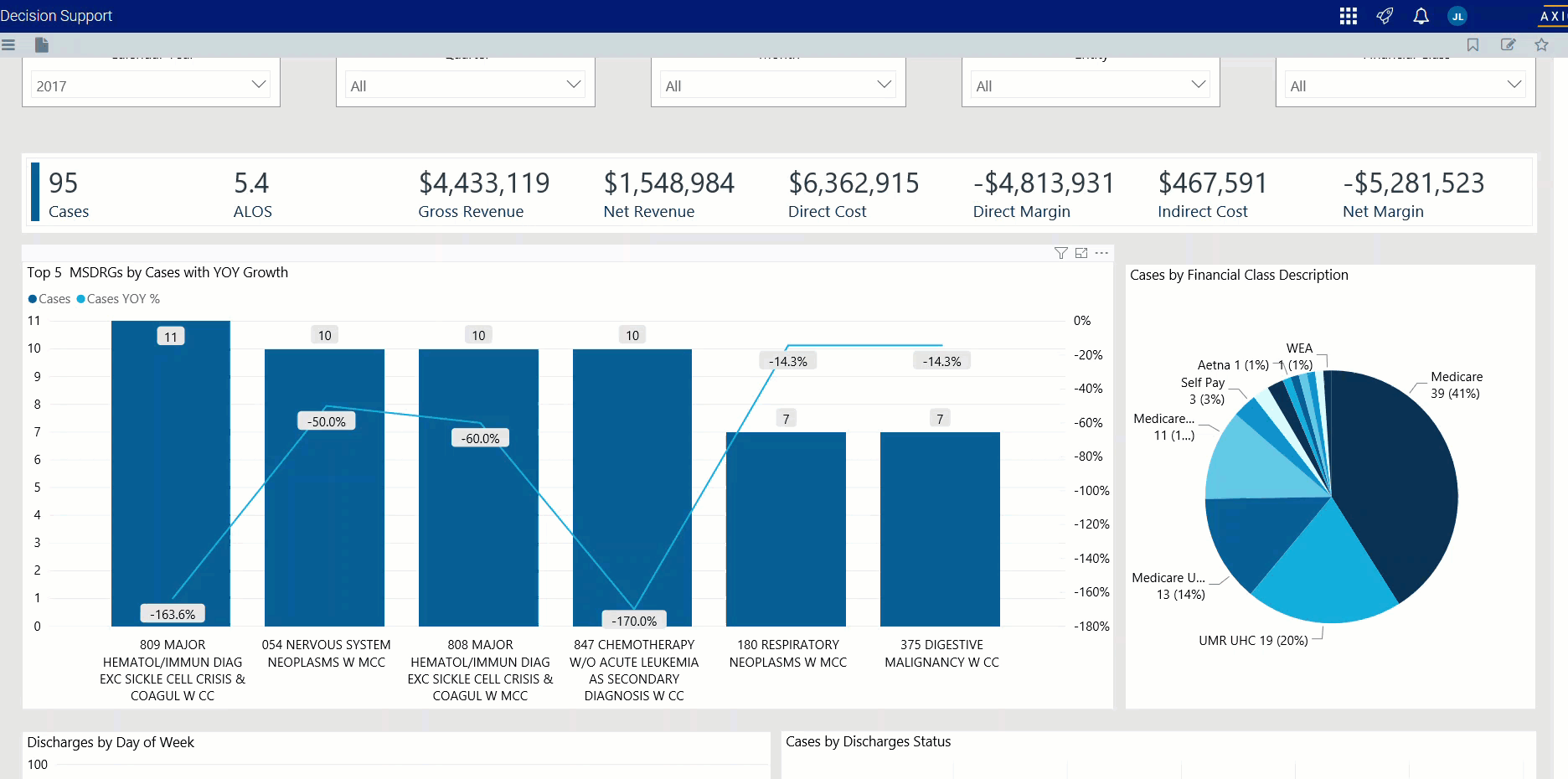
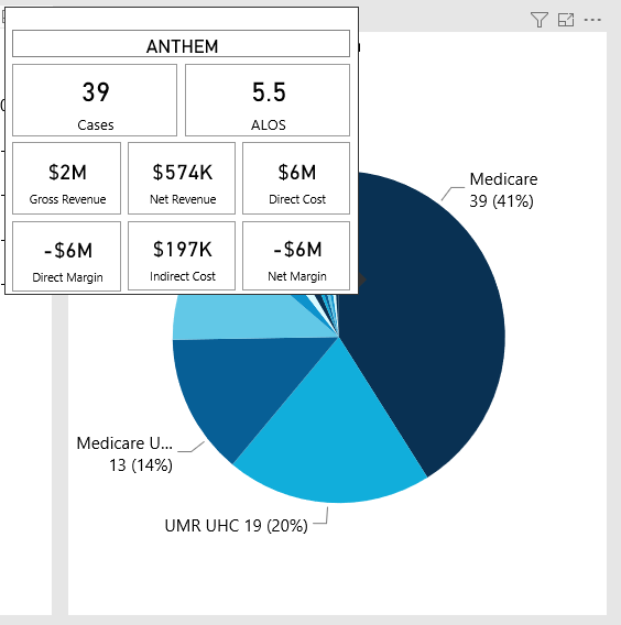
Cases by Financial Class Description
This sections displays a pie chart that breaks down cases by financial class. From here, you can do the following:
-
View details regarding cases, gross and net revenue, direct and indirect cost, direct and net margin for a financial class by hovering your cursor over a slice.

Click image to view full size
-
View the KPIs specific to a financial class by clicking a slice. The sections on the page will adjust to show the data specific to that financial class.
Click image to view animated GIF full size
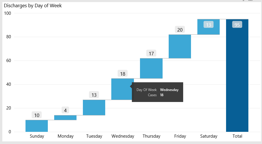
Discharges by Day of Week
This section displays a bar chart of the number of discharges broken down by days of the week. From here, you can do the following:
-
View the number of discharges for each day by hovering your cursor over a bar.

Click image to view full size
-
View the KPIs specific to a discharge by clicking a bar. The sections on the page will adjust to show the data specific to that discharge.

Click image to view animated GIF full size
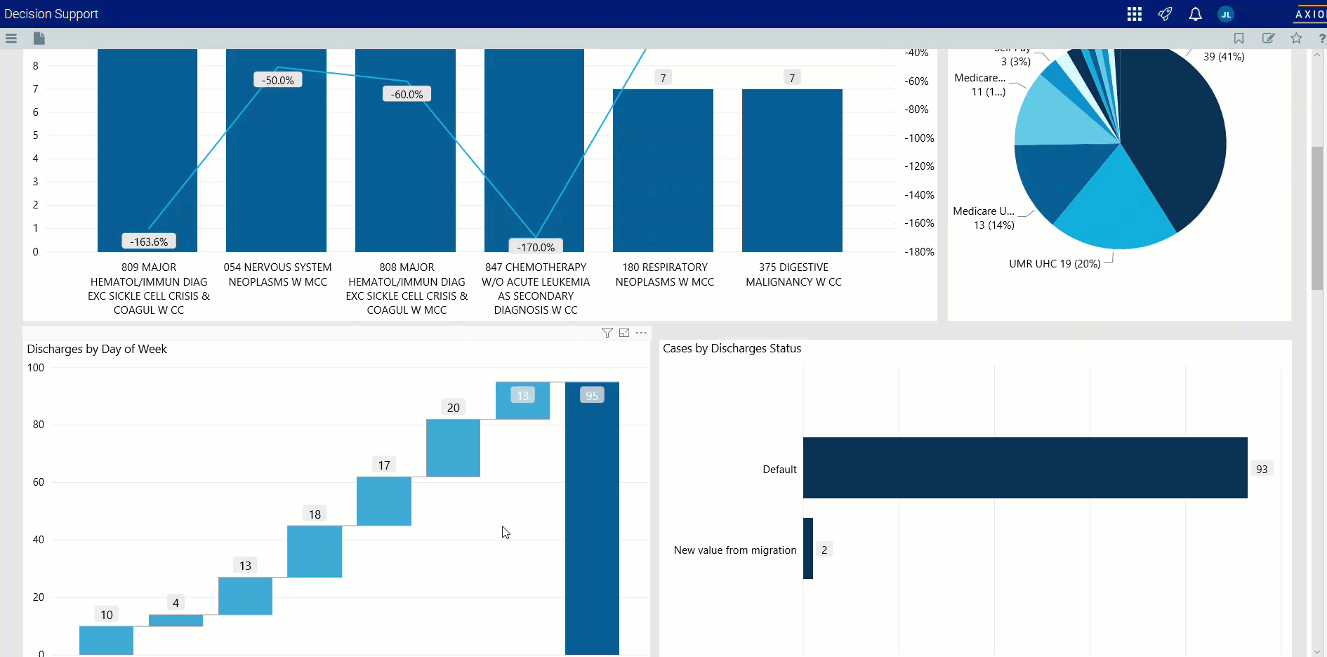
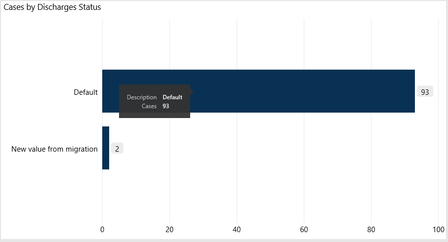
Cases by Discharge Status
This section displays the cases by discharge status. From here, you can do the following:
-
View the number of cases for a type of discharge status by hovering your cursor over a bar.

Click image to view full size
-
View the KPIs specific to a discharge status by clicking a bar. The sections on the page will adjust to show the data specific to that discharge.

Click image to view animated GIF full size
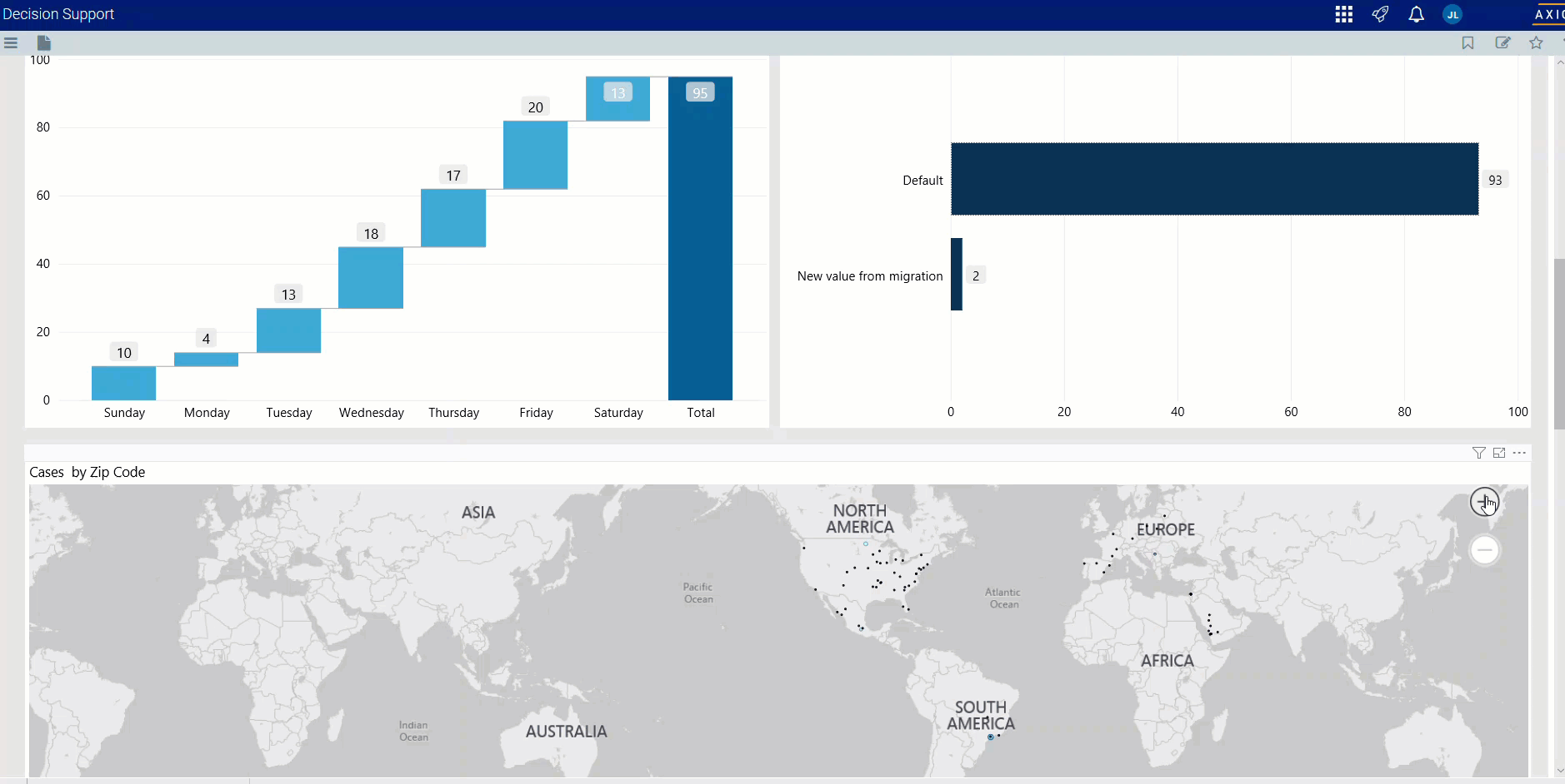
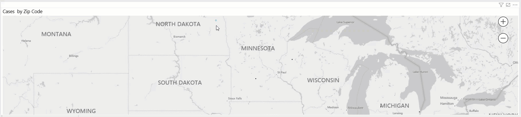
Visits by ZIP Code
This section displays the cases by location using a map. From here, you can do the following:
-
Zoom in and out of the map by clicking + or - on the right side of the page. You can move the map by holding down the left mouse button and moving the mouse to the area to view.

Click image to view animated GIF full size
-
View the ZIP code and number of visits for a location by hovering your cursor over a dot on the map.
Click image to view animated GIF full size
-
View information about visits specific to that location by clicking a dot on the map, and the sections on the page will adjust accordingly.

Click image to view animated GIF full size
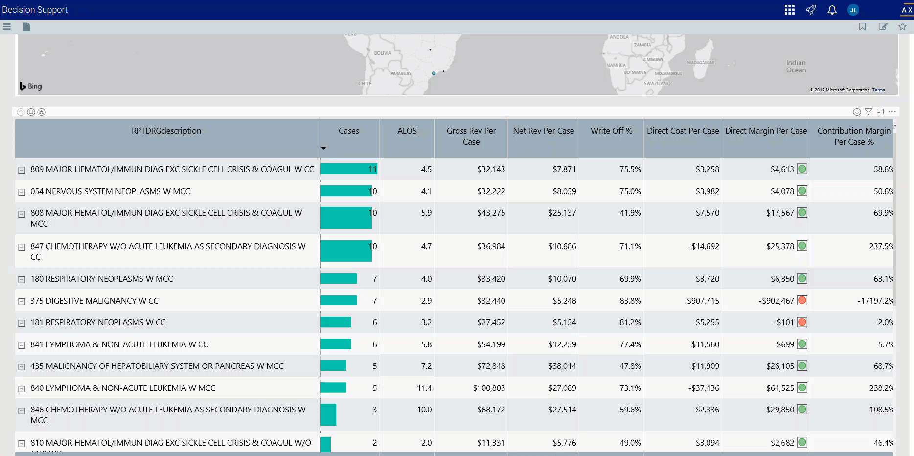
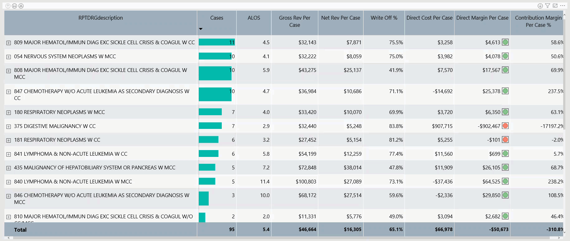
DRG Diagnosis Detail
This sections displays the revenue values related to profitability for each DRG. From this table, you can do the following:
-
View the details for a DRG by clicking a row. The system greys out the details for the other descriptions across the page except for data specific to the description you selected.

Click image to view animated GIF full size
-
Sort the table by columns in ascending or descending order by clicking the column header.
Click image to view animated GIF full size
-
Drill up or down through the data by right-clicking the row, and then selecting Drill Up or Drill Down.
Click image to view animated GIF full size

Viewing data in table format
You can view the underlying data for visualization graphs and tables by right-clicking the image or table, and clicking Show as a table. A data table displays underneath the visualization graphic or table. To return to the dashboard, click Back to report in the upper left corner of the page.
Click image to view animated GIF full size
